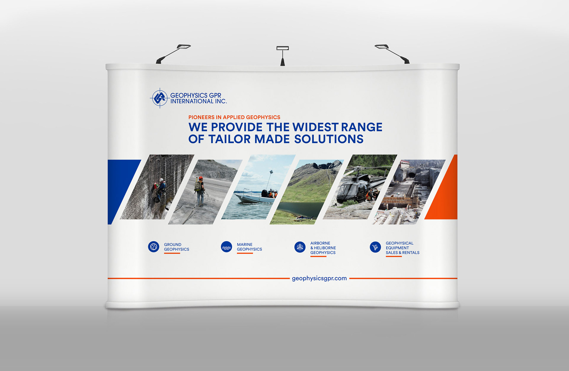
Client Background: Based in Quebec, GPR International Inc. has been a pioneer in geophysics for over 40 years.
Objective: Revamp their printed communication tools to create a new visual identity that highlights their expertise and versatility while standing out from the competition.
Approach:
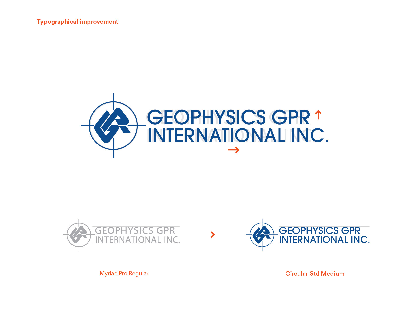
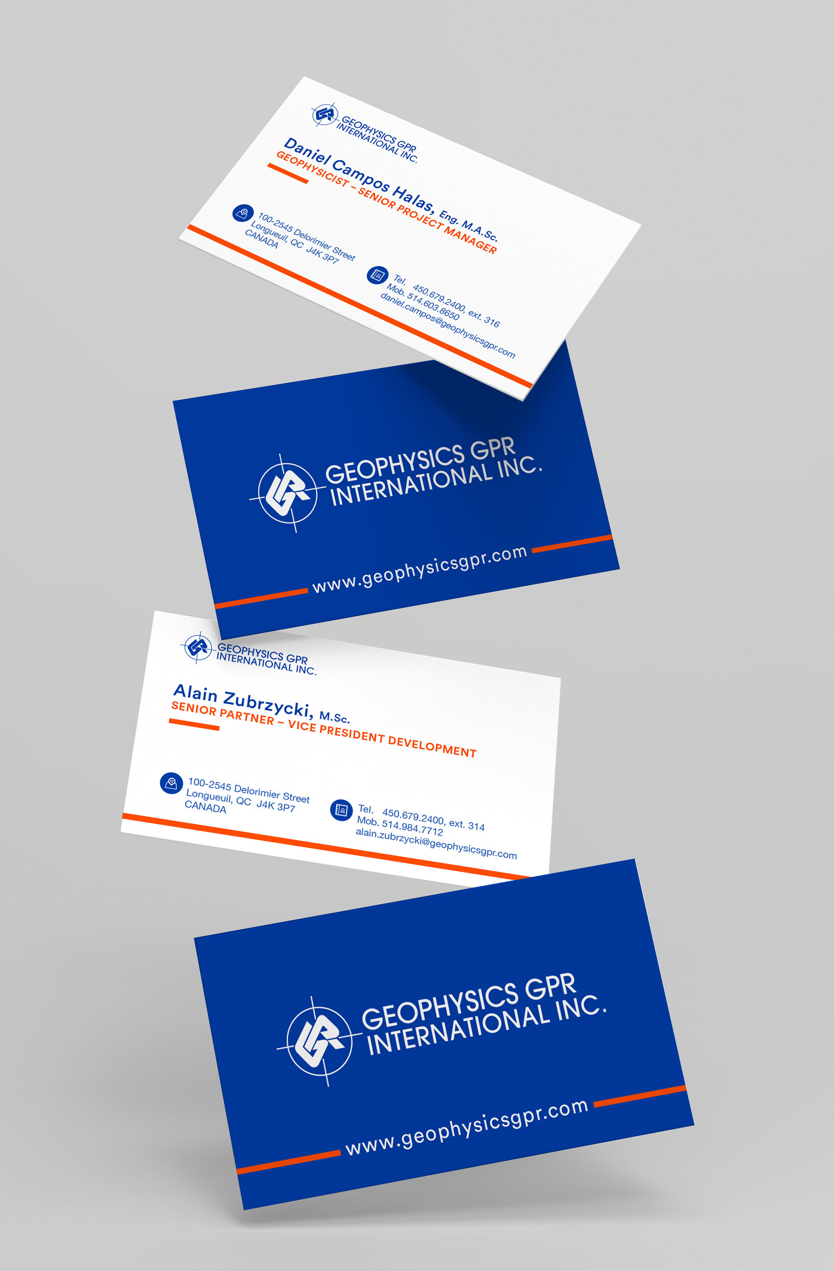
Logo Typeface Update: Modified the typeface to Circular Std to enhance legibility and presence, giving the logo a modern, dynamic feel.
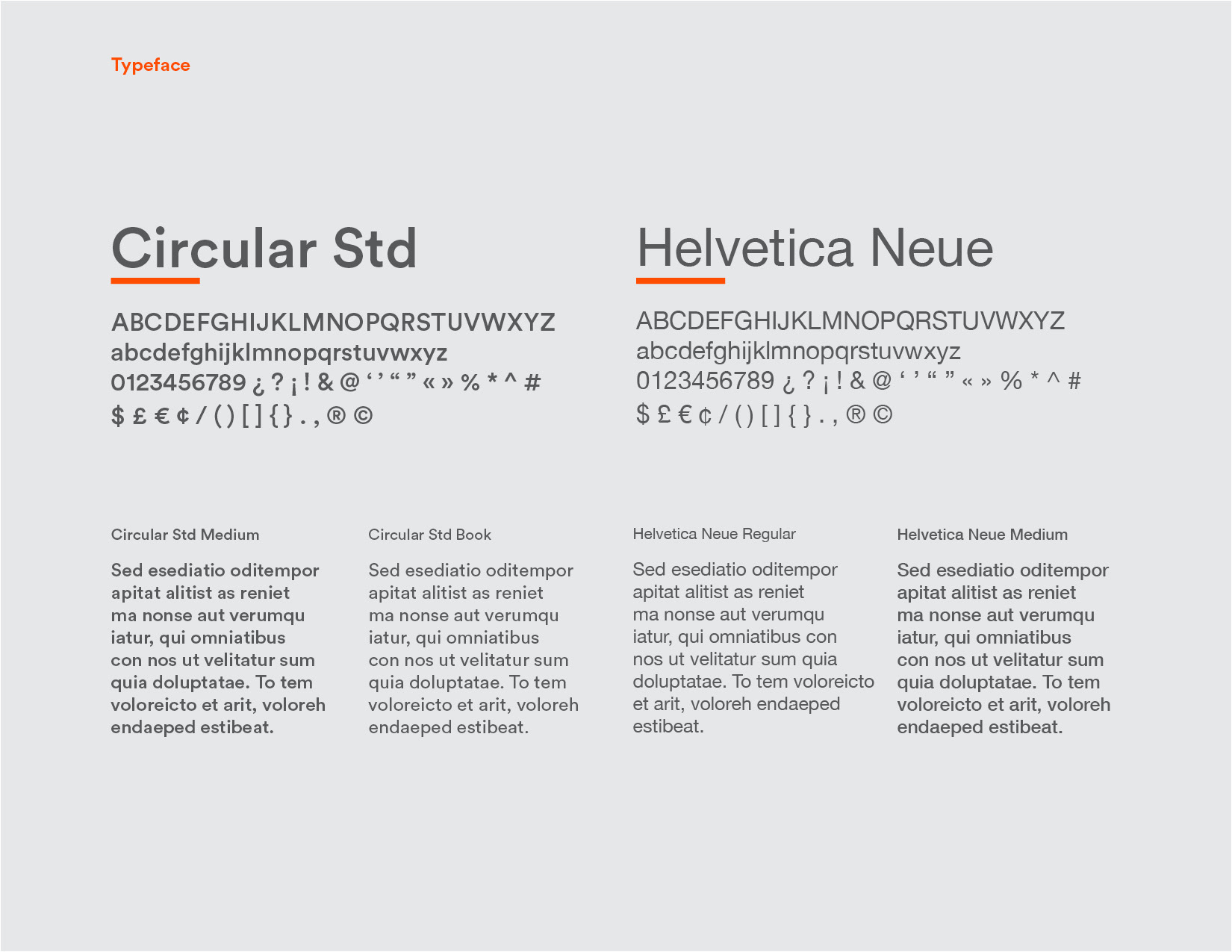
Typography Overhaul: Replaced Myriad Pro with Helvetica Neue for body text, providing classic simplicity and improved clarity.
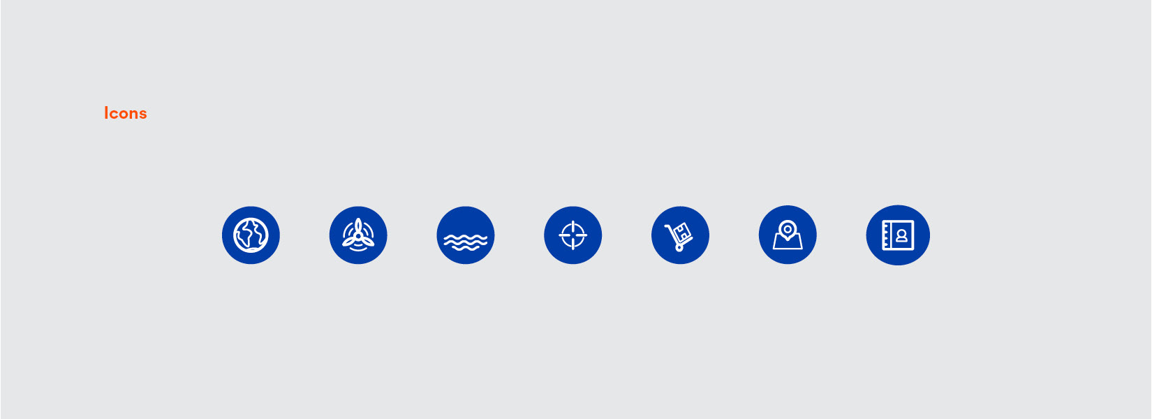
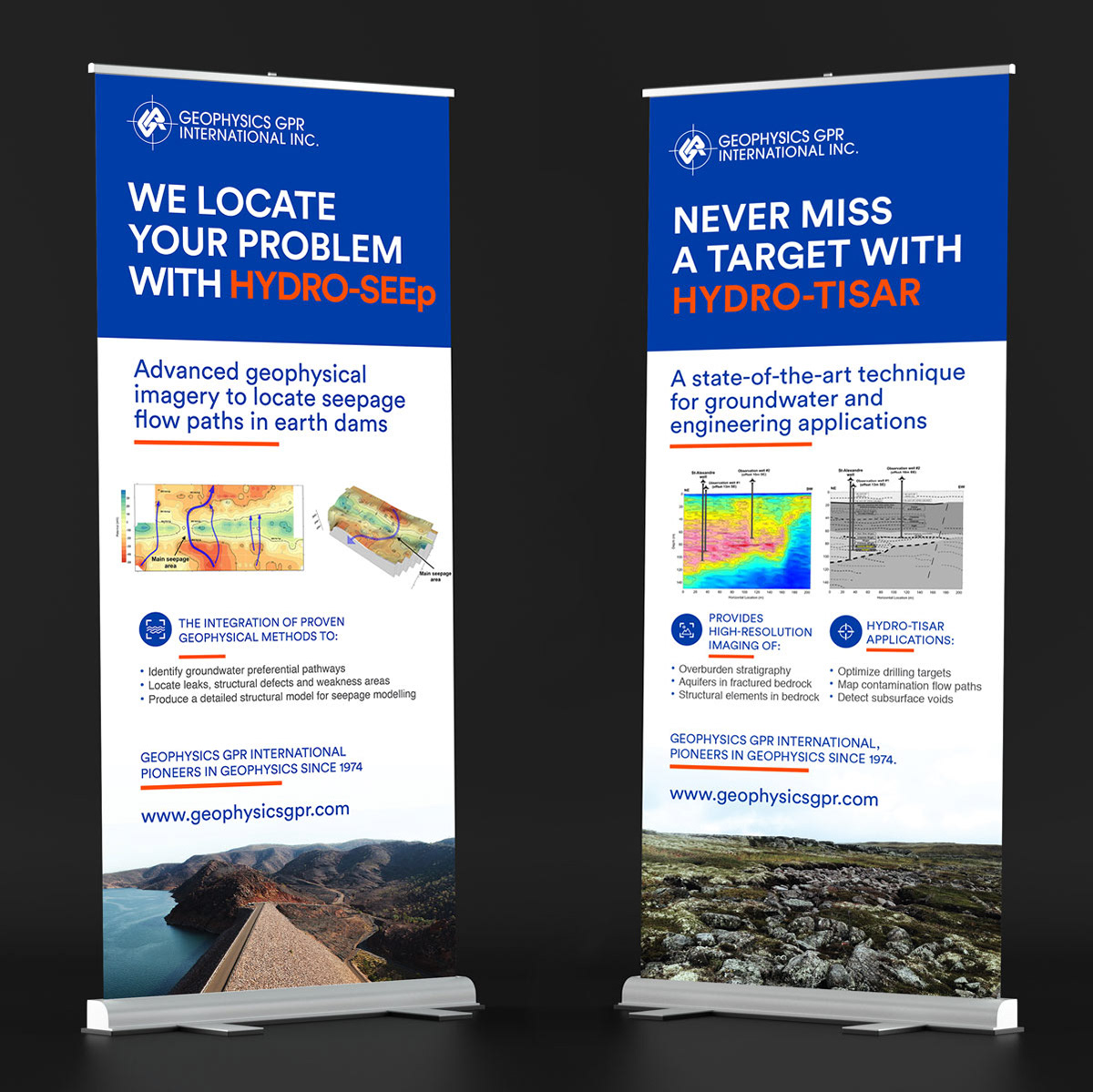
Visual Identity Redesign: Updated the color palette, graphic grid, and photo style to feature brighter colors, more stylized images, and a custom icon bank.
Editorial Grid: Implemented a more dynamic layout for better information clarity and comprehension.
Content Simplification: Rewrote complex scientific content to be more accessible to a non-scientific audience, using shorter, direct phrases.
Results: The new graphic identity of GPR International Inc. achieved improved clarity and modernity, making their products and services easier to understand and more engaging for a broader audience.
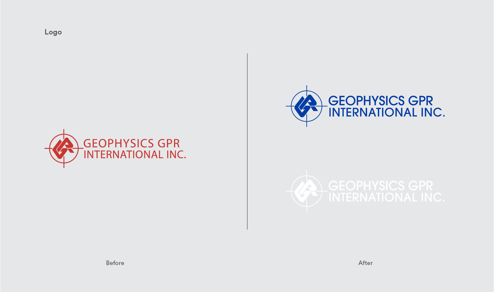
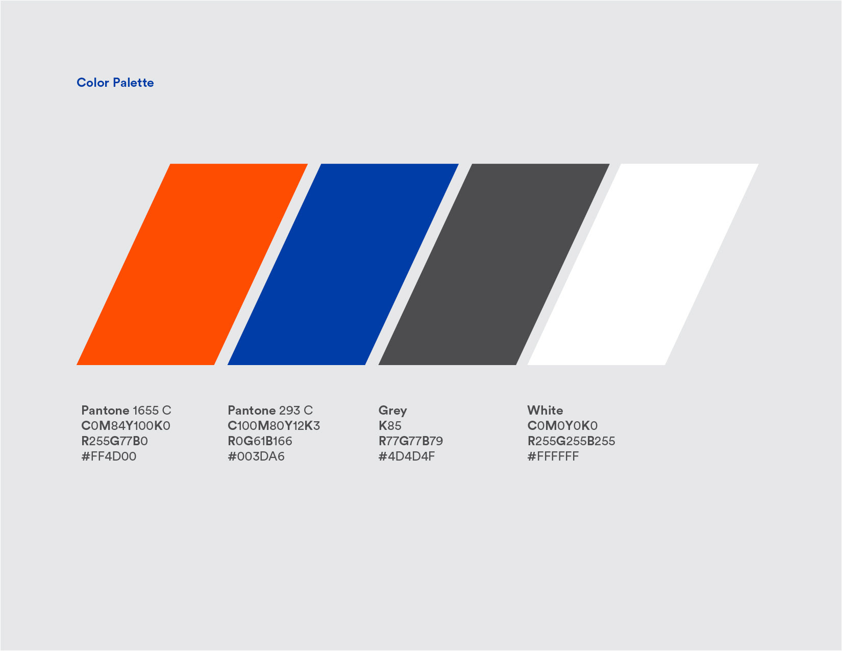
The content, the colour palette, and the graphic grid, as well as the style of the photos, were redesigned. Their new graphic identity features brighter colors, more stylized images, a custom icon bank and a more dynamic editorial grid. In addition, the new layout of the information allows for greater clarity and therefore a better understanding of their products and services.
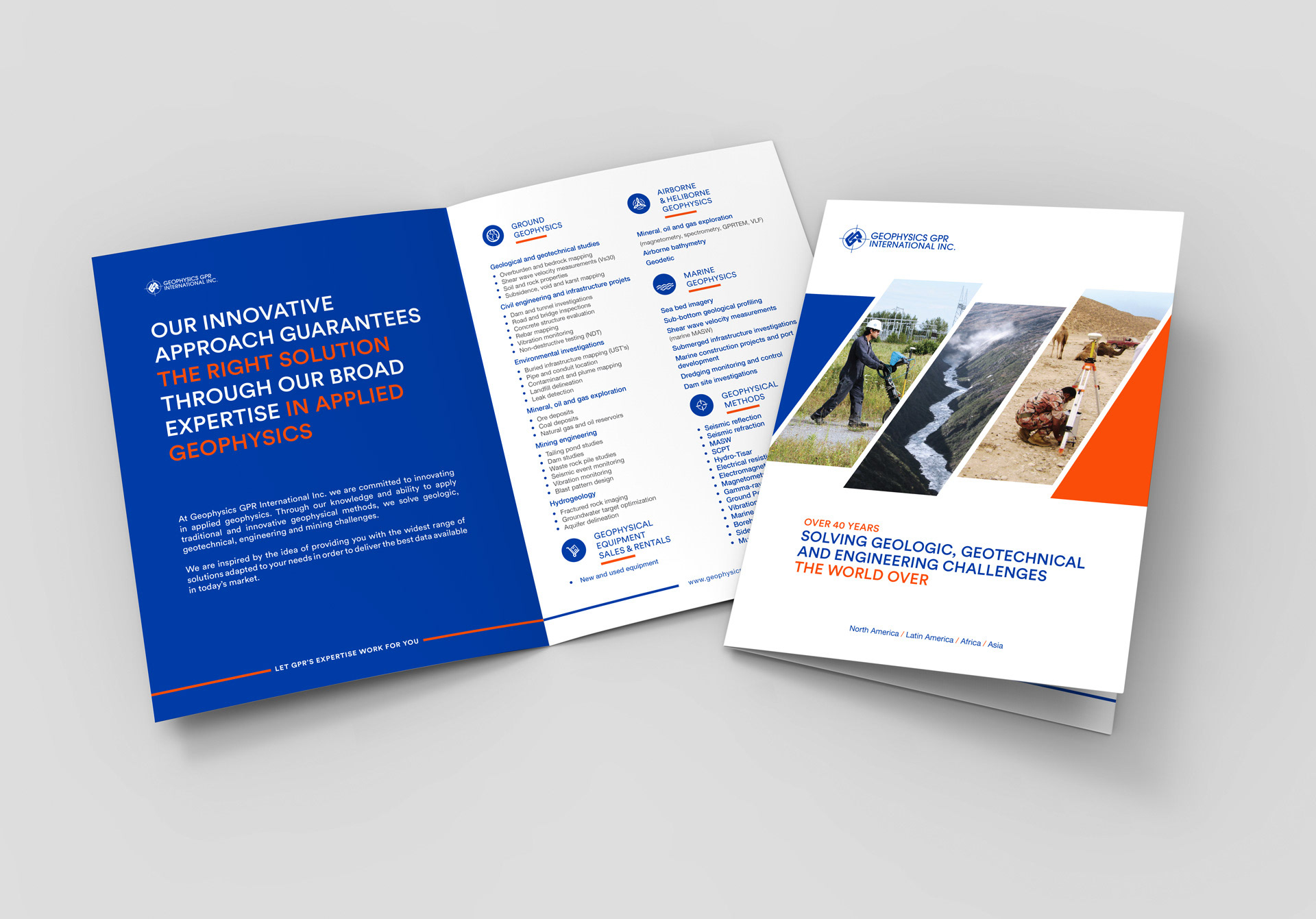
The copy of the content, of a complex scientific nature, was also modified to make it more accessible to a broader, non-scientific clientèle. Shorter and to the point phrases were incorporated into their communications and trade show material. The amount of information remained the same but the layout allowed for better comprehension and clarity.
Project made in collaboration with CoCréa Studio.